Introducing #ascotvaleprojectxhehe.
This project has been ticking away for a couple of years now and I’m so pleased to finally be able to share some photos of the finished bedrooms and bathroom with you!
This apartment is in an old 70’s apartment block. It has a cosy internal footprint comprising two bedrooms, bathroom, living room and kitchen. The apartment (pre-Hè Hè) had cream coloured walls, drab venetian blinds and pink carpet. Normally I’d be excited about the pink, but this carpet had definitely had its time!
I used my client’s wardrobe (full of patterns and colour) and favourite colour (blue) as the inspiration for injecting some colour and their personality into the design. The brief was initially pitched as “white, light and bright” and while this was the design direction to begin with, as the design process evolved and as we discussed lots of options, my client fell in love with a darker, moodier vibe. I’m here for it.
BEDROOMS
The bedrooms are cosy and the original storage options were inadequate (one robe was completely restricted by a window and was not even deep enough for a coat hanger!). So, with some clever reworking of the layout and custom cabinetry, there is now a much more functional floorplan and greater storage options, which is critical in apartment living.
I opted for a blue-grey wall colour while keeping the robes and trims white. The white plantation shutters offer a contemporary feel and provide privacy and block out in a single application. The horizontal lines created by the shutters also offer a subtle contrast and texture against the solid wall colour.
In the main bedroom, the robes were relocated to the opposite side of the room, creating depth (adequate for hanging clothes!) and a little bench seat that has deep drawer storage underneath. Luxurious wool carpet in a warm grey tone was installed to provide a lovely texture and warmth to the flooring, which sits nicely against the light oak flooring used in the other areas of the apartment.
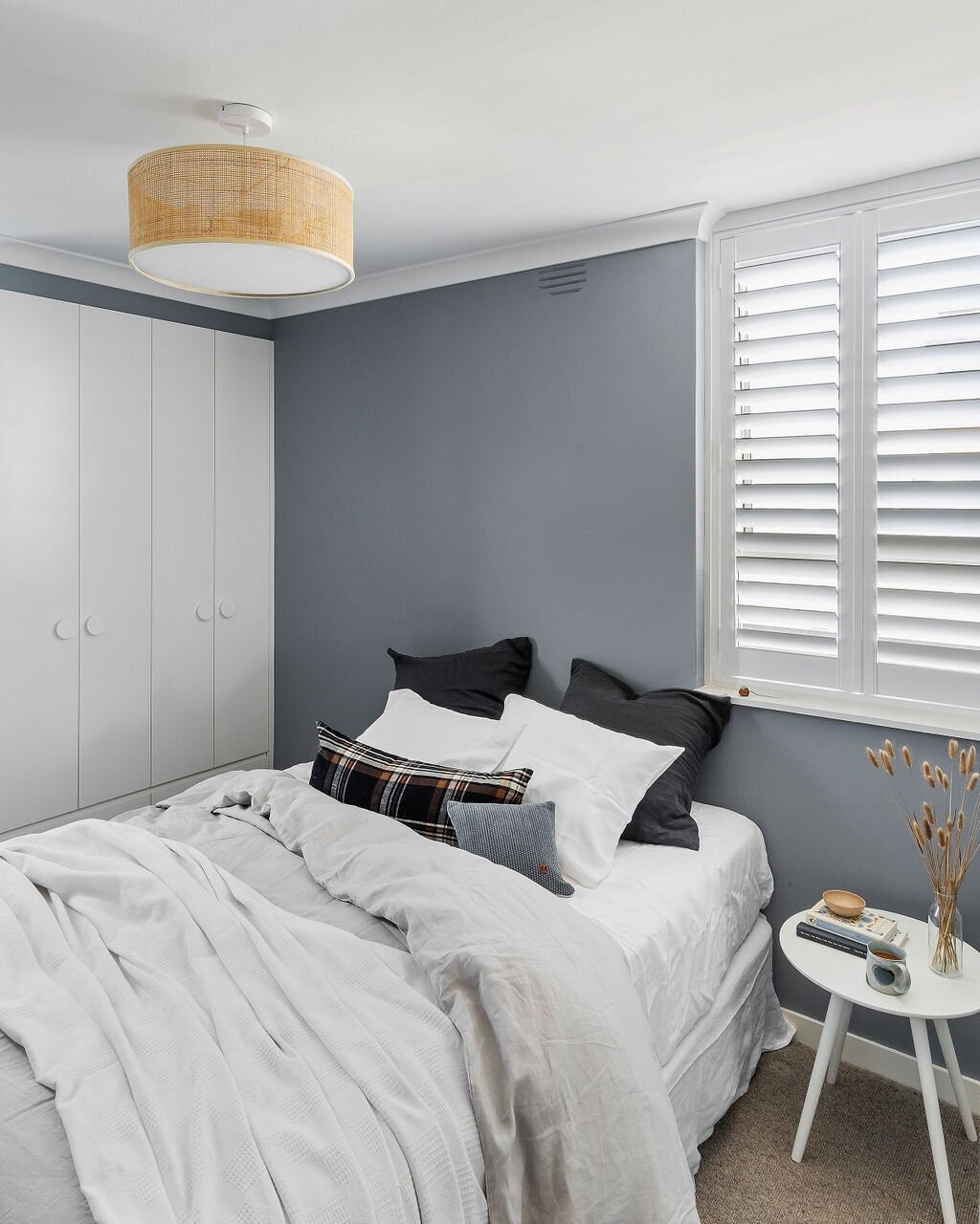
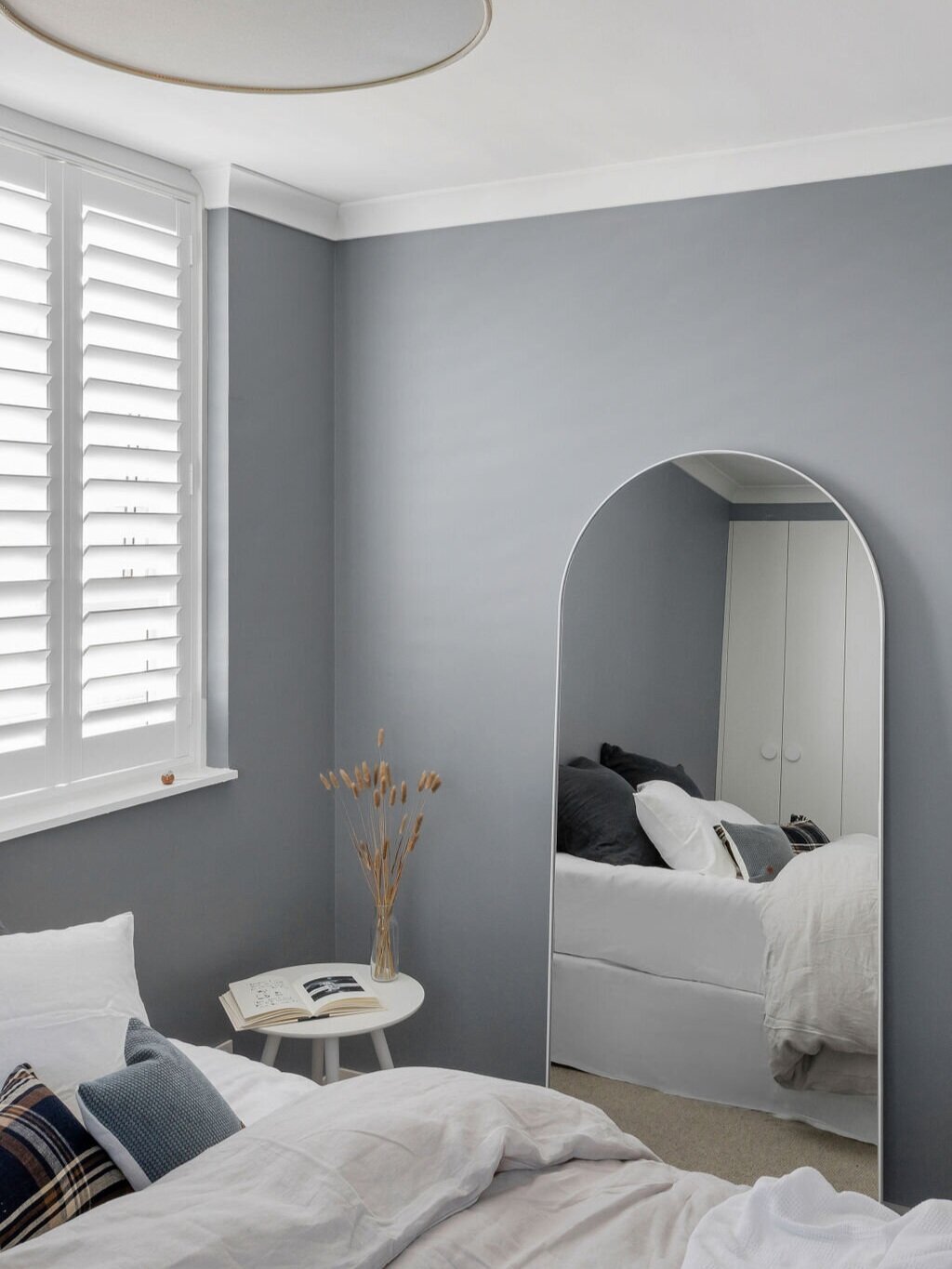
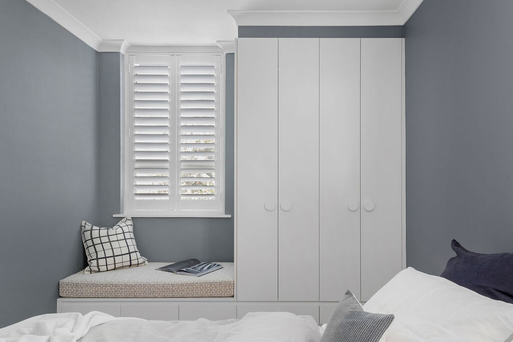
““Erin challenged me to push the boundaries and as a result I have two beautiful bedrooms and a luxurious bathroom that I couldn’t be happier with!”
BATHROOM
The bathroom was original to the building and graced with a patterned yellow tile. It was a super squeezy space and housed a shower over bath, washing machine, laundry trough, basin and toilet. For a small space, it needed to perform a lot of functions and spatial planning was key. I love a design challenge, and this project was no exception. We completely gutted the bathroom and relocated plumbing to ensure we made the best use of space.
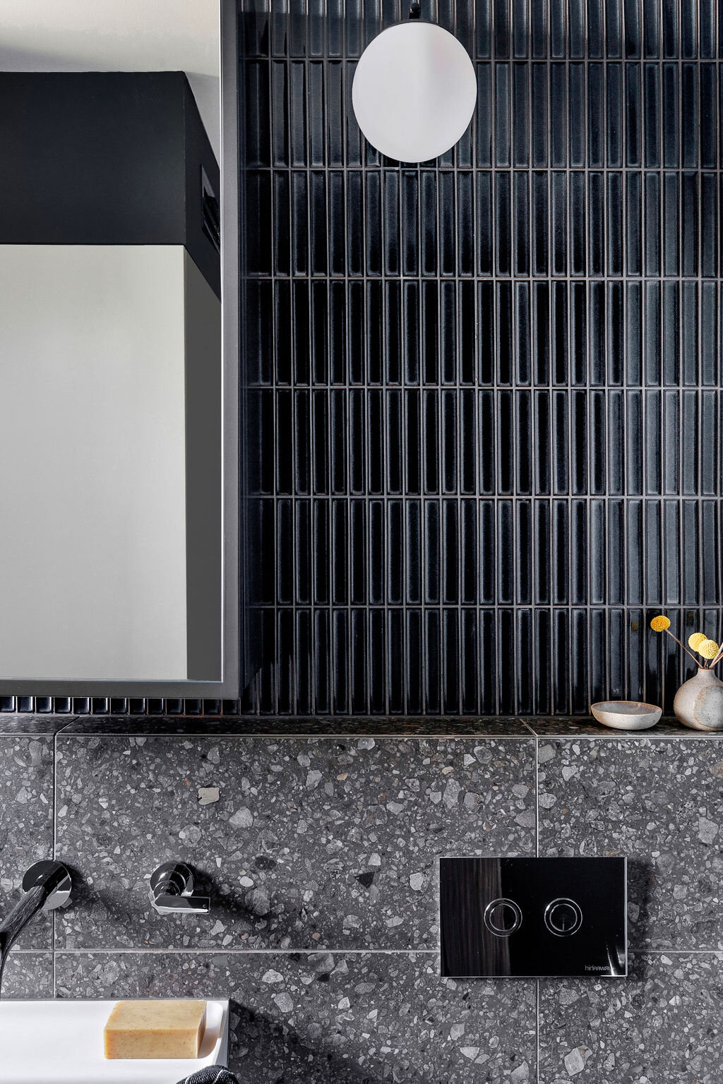
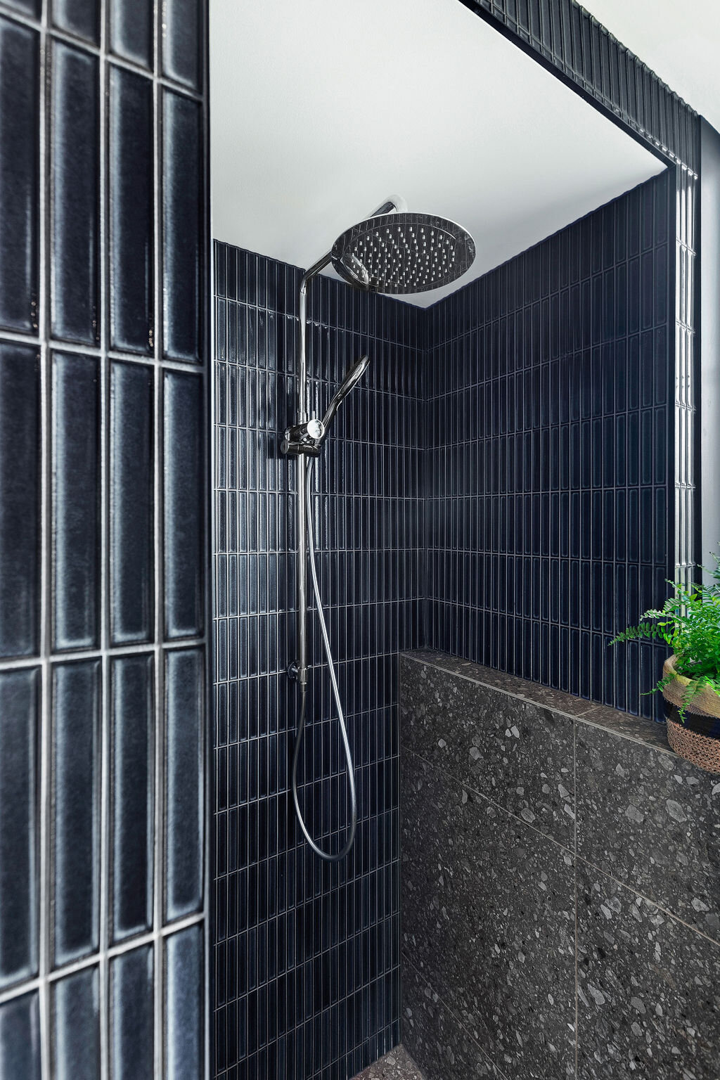
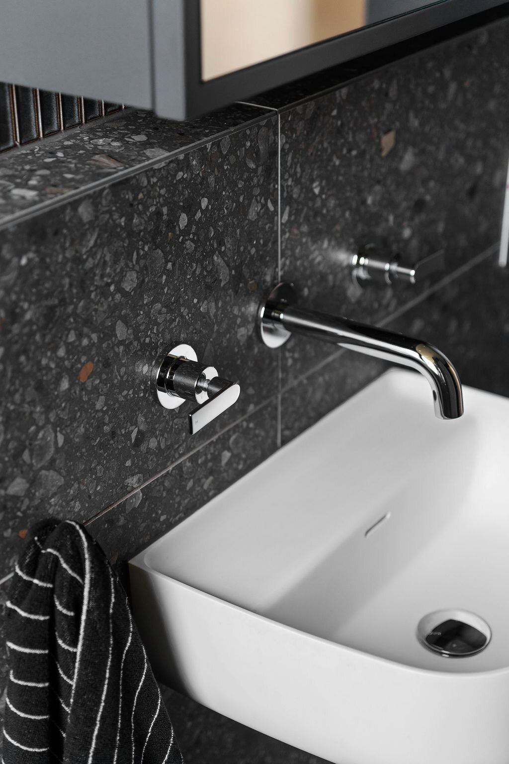
We decided against incorporating a bath into the new design, and instead opted for a large walk-in shower. As the bathroom needed to function as a laundry as well, I designed a custom cabinet that housed the washing machine and offered extensive storage above in a full height cabinet concealing linen, towels, surplus toilettries, laundry basket etc. The small floorplan meant that incorporating a vanity was simply not possible, so instead I selected a wall hung basin with a built in shelf to hold soap etc. A custom medicine cabinet in the same blue colour as the walls and tiles was designed to offer face level storage. The large mirrored front helps to reflect light around the room. Due to the brick construction of the building, it was not possible to recess the cabinet and rather than building a wall in which to recess the cabinet, I opted for a nib wall which served a greater function. This nib wall ran around the perimeter of the bathroom and into the shower, offering a ledge to place toiletries since there was no vanity benchtop to place items. It also houses the in-wall cistern for the wall hung toilet which is tucked away neatly out of sight.
My client loved the moody concept and fell in love with the dark blue mosaic finger tiles. The dark, terrazzo-look floor tile references the terrazzo found in the communal areas of the apartment building, and ties in perfectly with the warm grey carpet that features in the bedrooms.
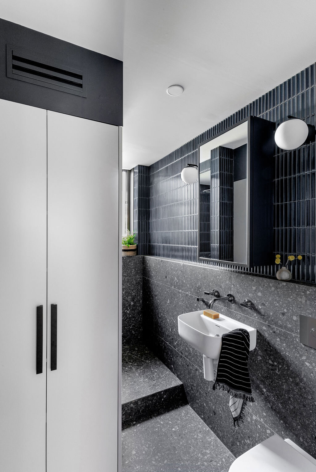
““This bathroom is lux! Erin’s skill has transformed a once small and awkward space into a fully functional and ingeniously designed room. The walk-in shower, ample storage, deep blue tiles and mood lighting are just some of the features that I get to appreciate and enjoy every day.”
This was such a fun project showcasing the best parts of the creative partnership between designer and client, and the growth and trust that comes with this. I’m excited to say there will be more to come! Stay tuned.
Check out more photos from this project here.
Photography: Maegan Brown Photography
Build: Nook Construction

